Franco BluePrint UI Design
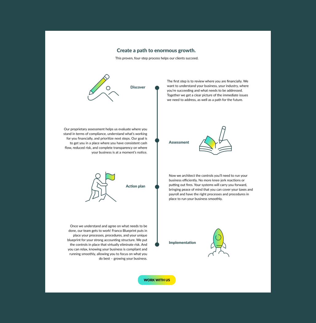
Franco Blueprint works nationwide helping clients in a range of industries prosper their businesses.
They came to me as they were preparing to re-think their user interface and experience on their current website, as well as improving their design and brand identity
that positioned them as innovative and trusted leaders in the CFO business.

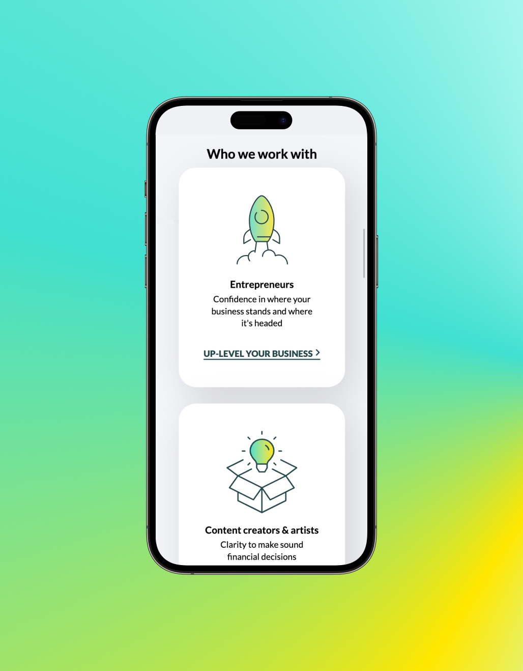
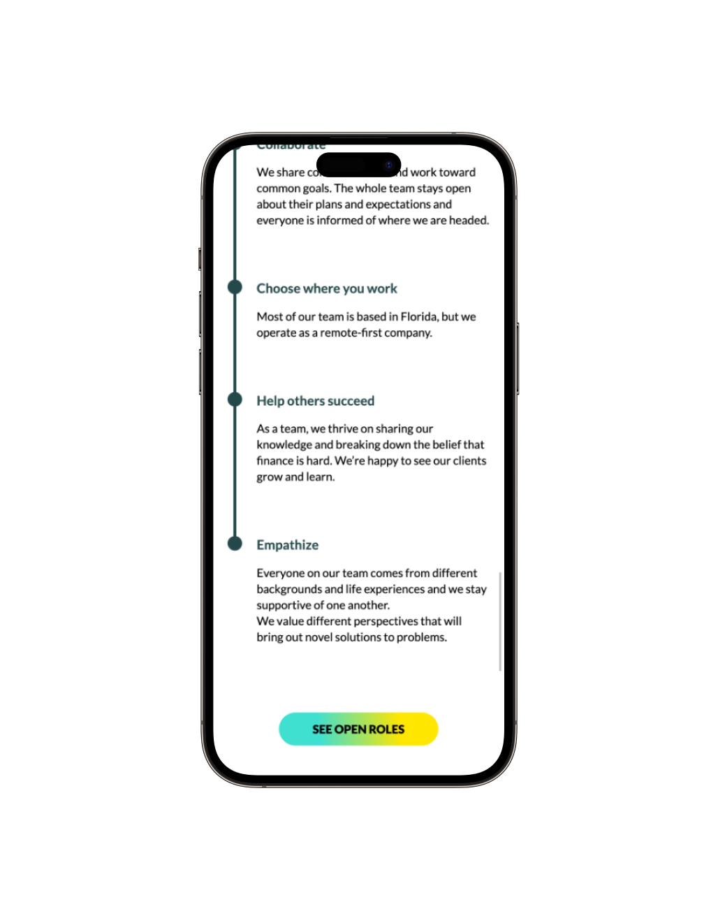

It was important to bring a distinct visual system to the website and define the sections and visual elements that were more important for the company to convey to the user.
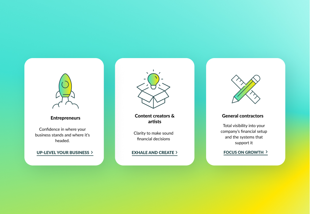


The color palette creates a rich contrast with the gradient library. Combined they add energy and sophistication to the brand.


It was important to bring a distinct visual system to the website and define the sections and visual elements that were more important for the company to convey to the user.

Through a consistent use of icons, color palette and fonts, it was easy to navigate and the sections were easy to differentiate, allowing the brand to have consistency and creating a clear path for the user.

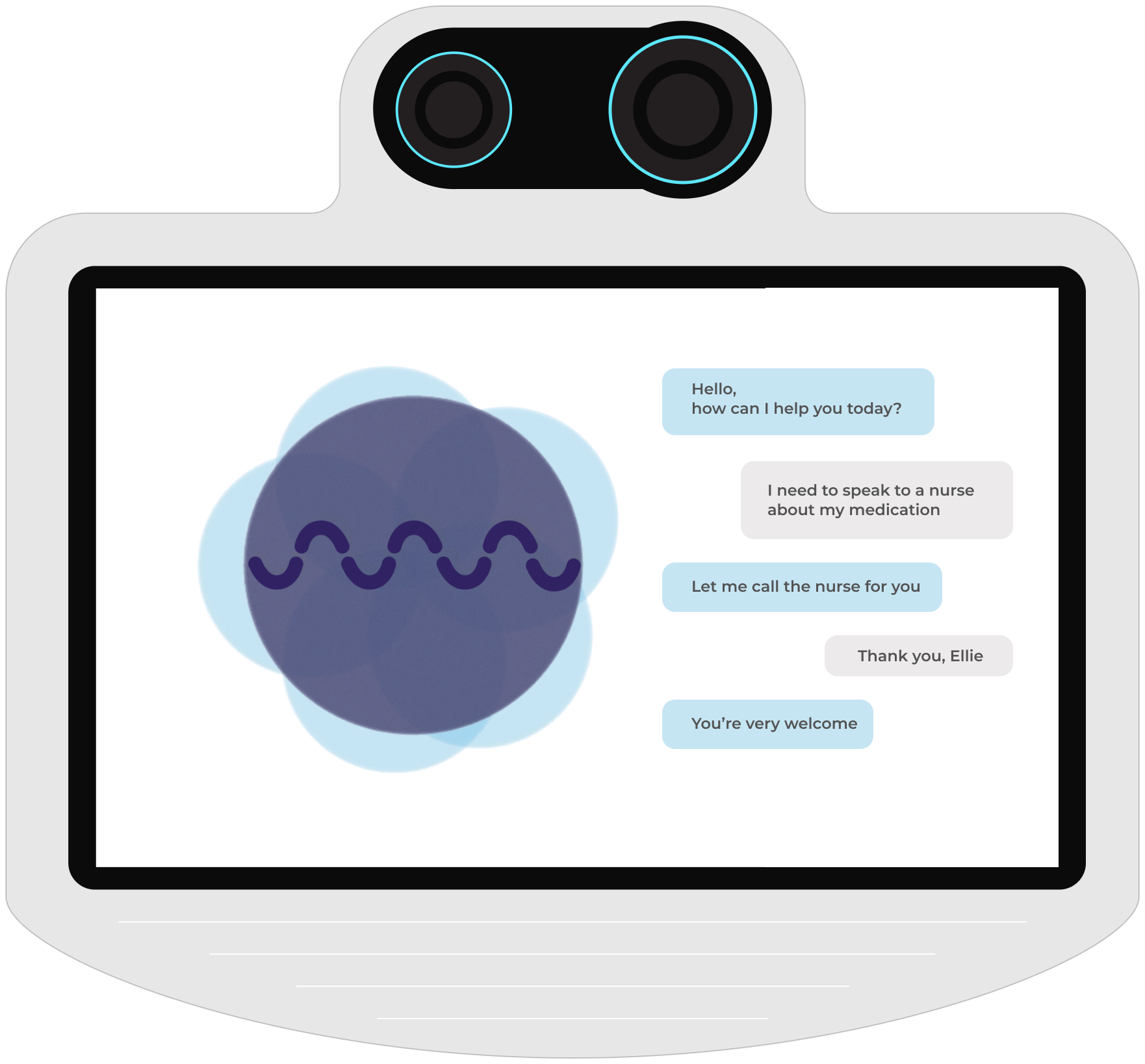
Virtual Assistant Ellie
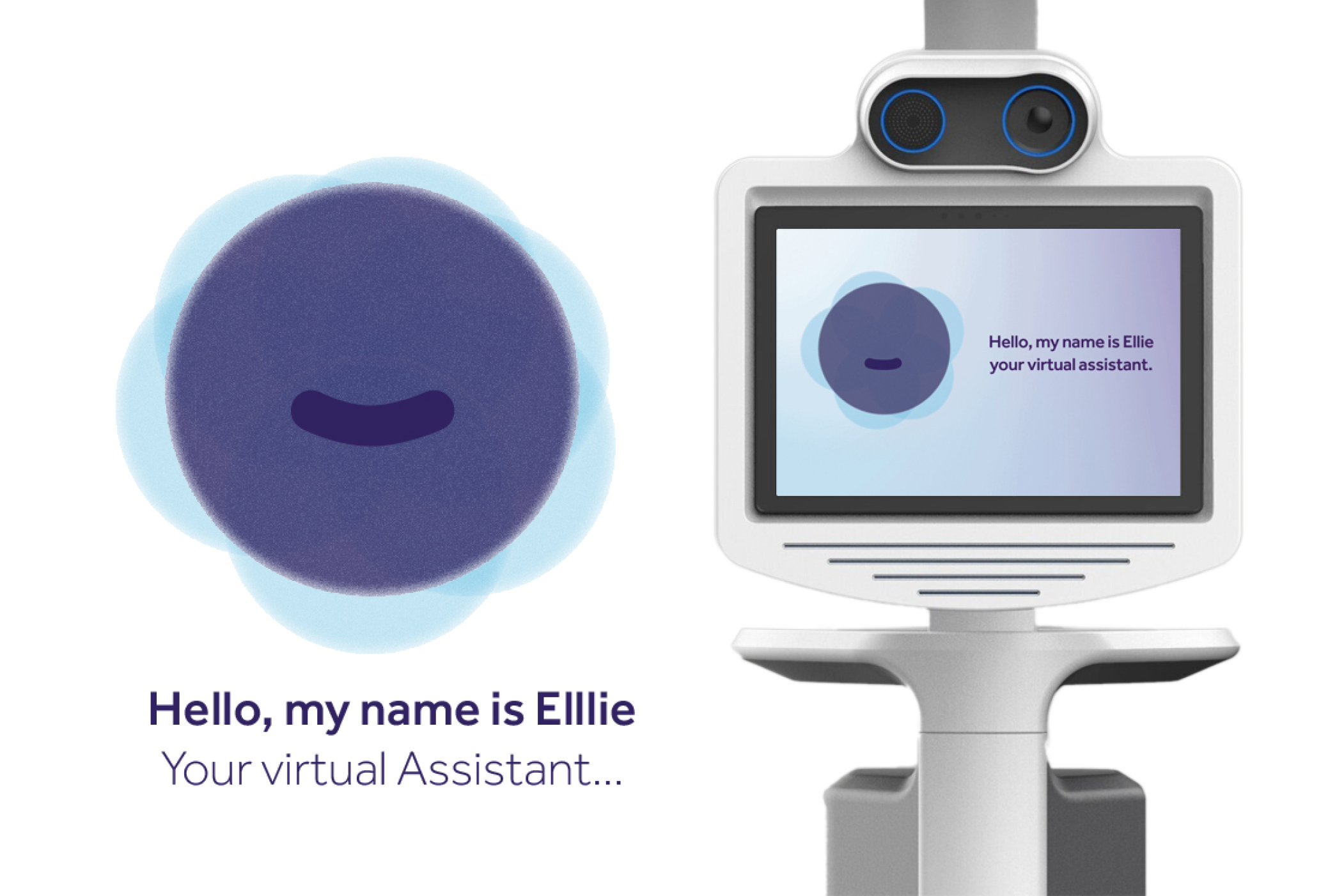
Worked on the User Interface and User Experience proposal development of the Intouch Health virtual assistant that would be transitioning to a Teladoc Health brand, utilizing brand components to make a virtual persona that would communicate calmness as well as having it be in an interface that was easy to use for patients of all ages, considering the stressful environment a person can be going through in those types of situations.



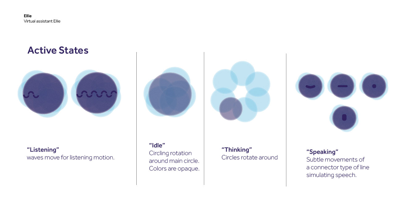
The different states of Ellie reflect the response for the user so it's easier to communicate and understand how it works.
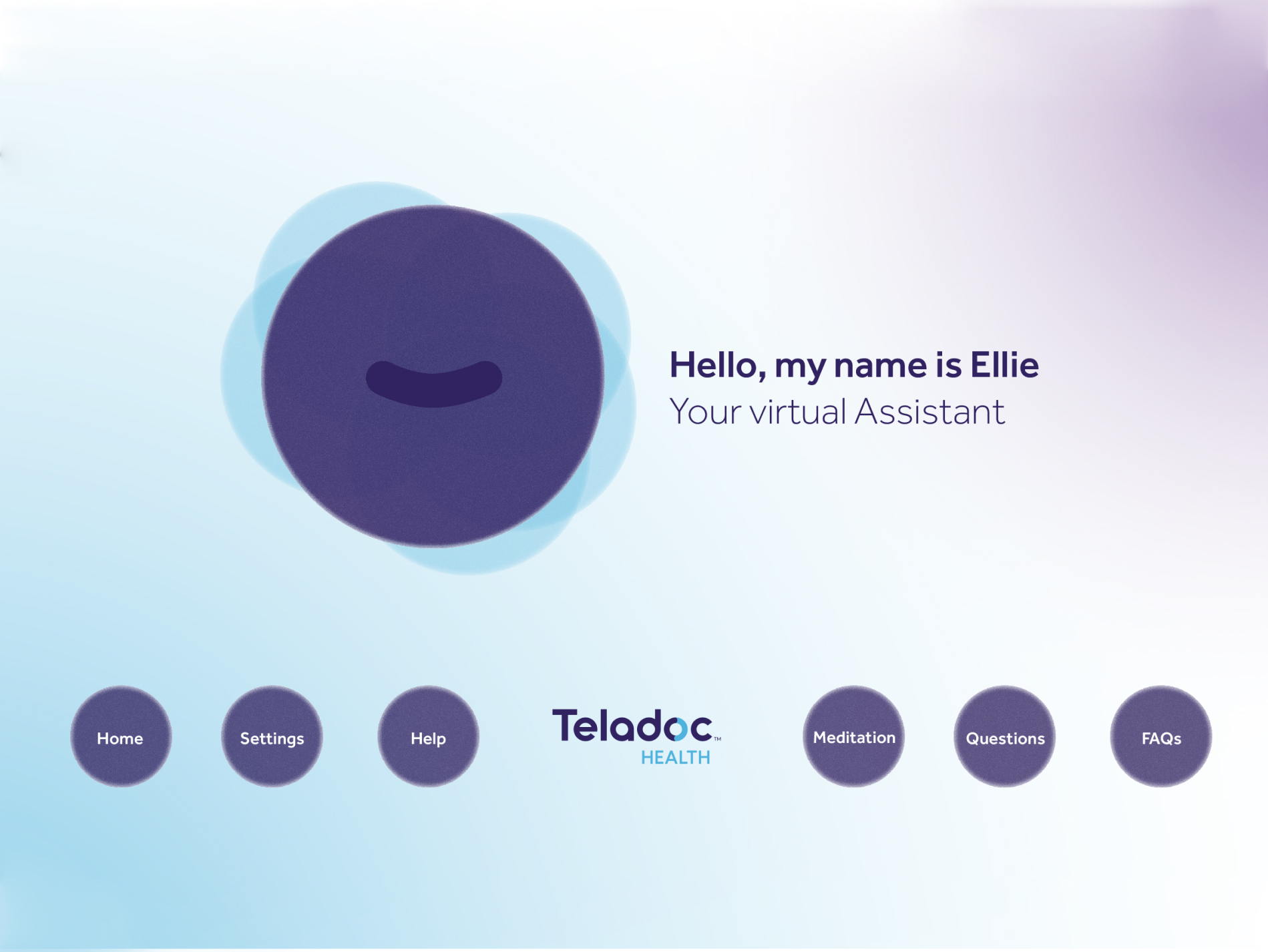
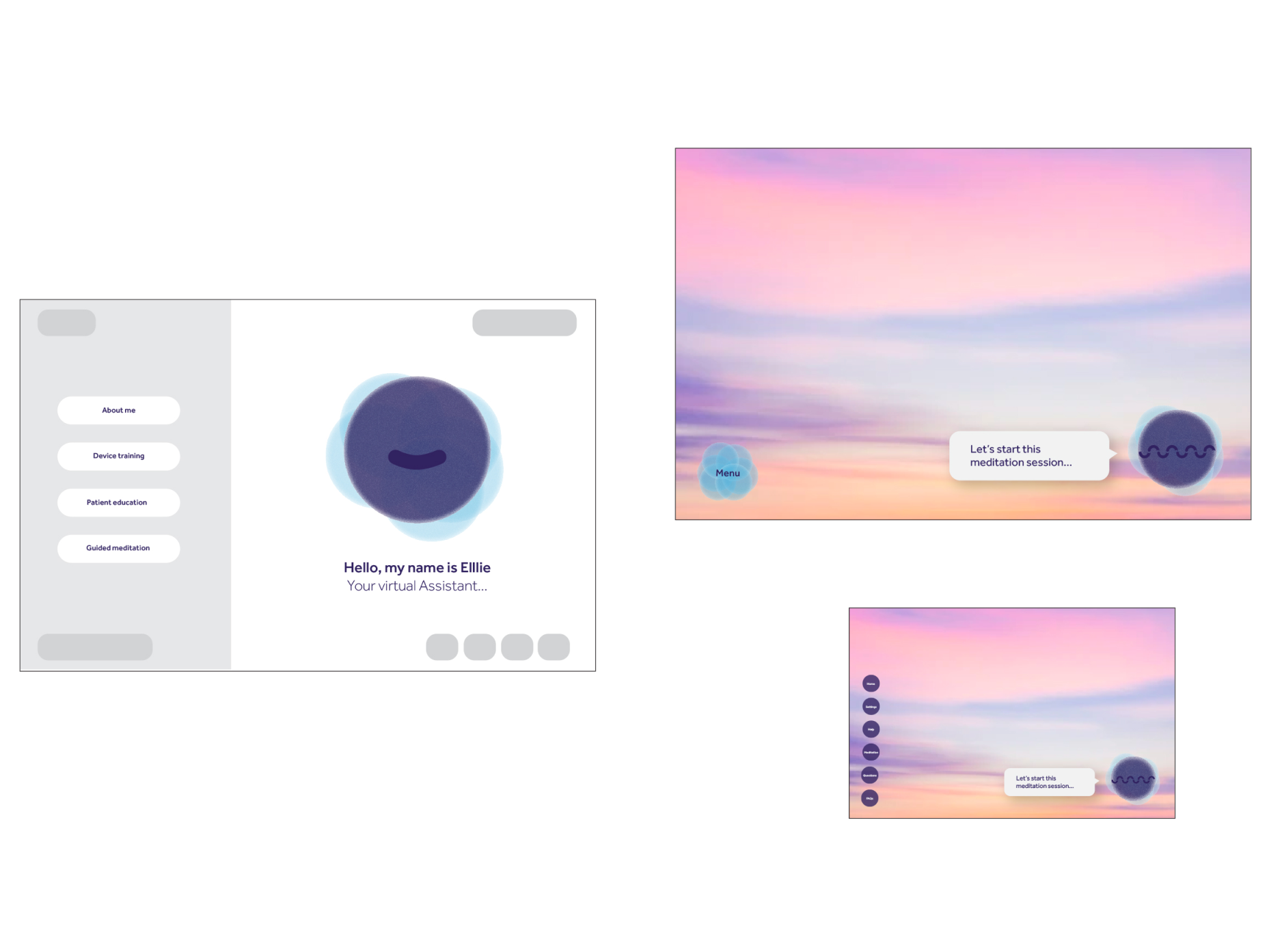

The interface was shown to the stakeholders through motions for the virtual assistant as well as how it will look on the product and an example of one of it's options which is meditation.
