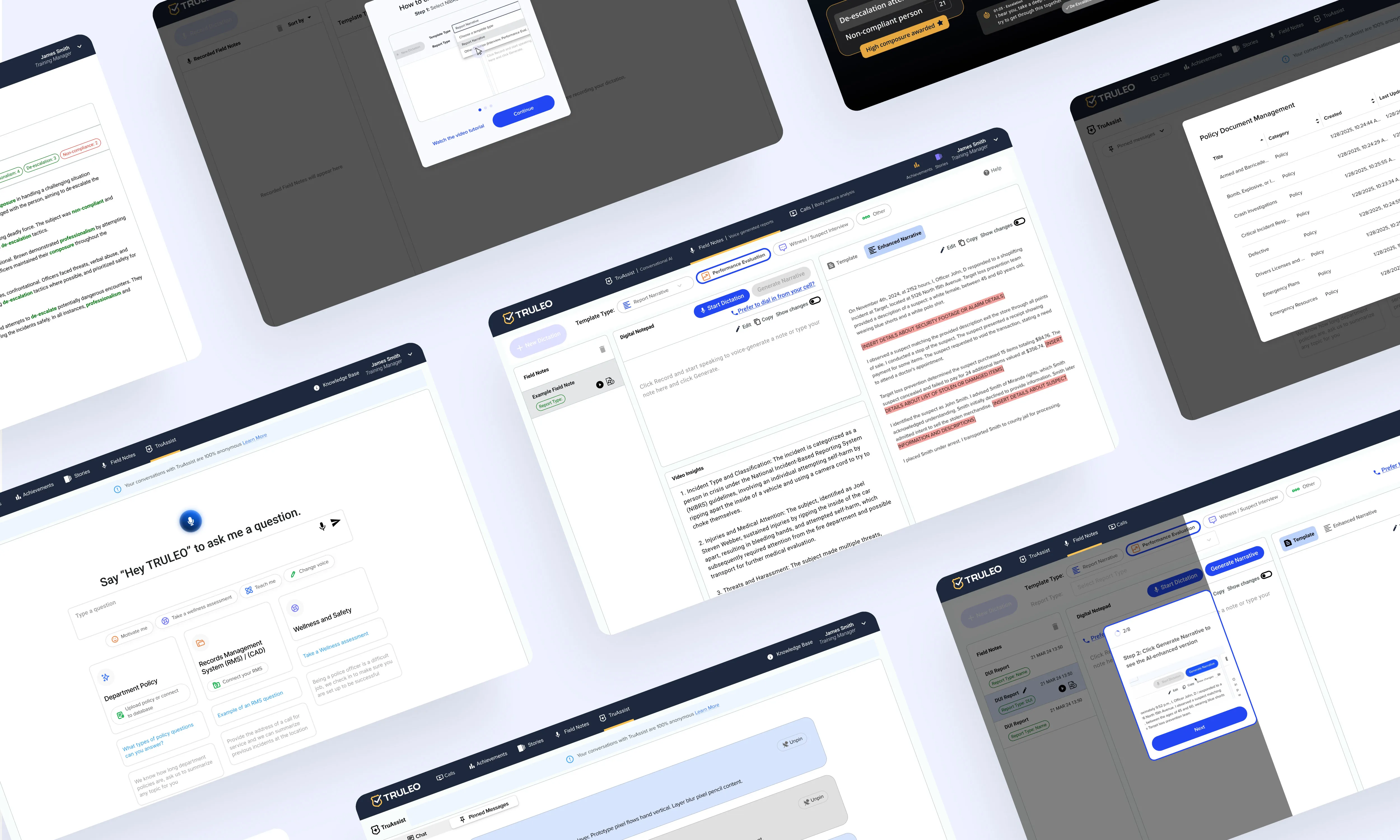
Improving Usability & Retention for a Law Enforcement Web App


The Problem
This web app is designed for law enforcement agencies to celebrate police professionalism by highlighting key moments in bodycam footage where officers demonstrate proper de-escalation techniques. The goal is to train new officers, reinforce positive behavior, and enhance retention while ensuring compliance with best practices.
However, the main screen—critical for user workflows—was overly complex and difficult to navigate. Officers and department admins struggled to understand what actions were required to process calls efficiently, leading to frustration, decreased engagement, and contract non-renewals. Without a clear, streamlined process, users found it difficult to manage their review queues, impacting adoption and retention.

The Solution
To address these challenges, I collaborated closely with the Customer Success Team, Developers, CEO, CTO, and Product Manager to identify pain points and reimagine the user experience. Our approach included:
✅ Prioritizing urgent workflows – Ensuring that critical tasks were surfaced immediately.
✅ Simplifying the call review process – Redesigning the main screen to present essential information clearly and reduce cognitive load.
✅ Enhancing visual hierarchy – Using layout, color, and icons to guide users through their tasks seamlessly.
✅ Iterating on design solutions – Testing and refining different approaches to ensure the best possible user experience.
By making navigation more intuitive and reducing friction in key workflows, we made it easier for officers to review, label, and assign calls without confusion.

The Results
The redesign led to significant improvements in user satisfaction and retention:
🚀 No loss of departments, with all contracts successfully renewed.
📈 8 new departments onboarded within 6 months, including police campuses and public safety departments.
⭐ Positive product reviews increased, leading to stronger recommendations and higher adoption.
🛠️ The successful changes also laid the groundwork for new feature development, further enhancing the product’s value.

Key Takeaways & Insights
- Simplicity is key – Even in a complex product, clear hierarchy and intuitive next steps can transform the user experience.
- Looking beyond our industry helps – Studying other products with similar workflows, even outside law enforcement, provided valuable insights.
- Design systems matter – The project underscored the need for a unified design system, consistent iconography, and thoughtful use of color to improve usability.
- Collaboration drives success – Open discussions and cross-team iterations were essential in creating a solution that truly met user needs.
This project reinforced the importance of user-centered design and how small, strategic improvements can drive engagement, retention, and business growth.
Some Product Screens and Workflows:
.webp)
.webp)
.webp)
.webp)
.webp)
.webp)
.webp)
.webp)
.webp)
.webp)
.webp)
Thank you!
For a deeper understanding of the improvements made to the web app and the design decisions behind them, explore the redesigned workflows and streamlined interface, If you’d like to learn more about the process, see prototypes or ask more about this project, feel free to reach out!
