App Illustrations Design & Testing
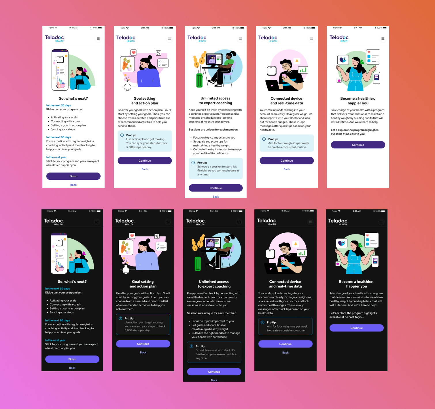

The Problem
A rebrand within the company did not seamlessly translate to the app, giving the need of a refresh in illustrations for user flows. This process revealed numerous discrepancies and repetitions, resulting in a lack of cohesiveness that failed to align with the brand's mission and vision.

The Resolution
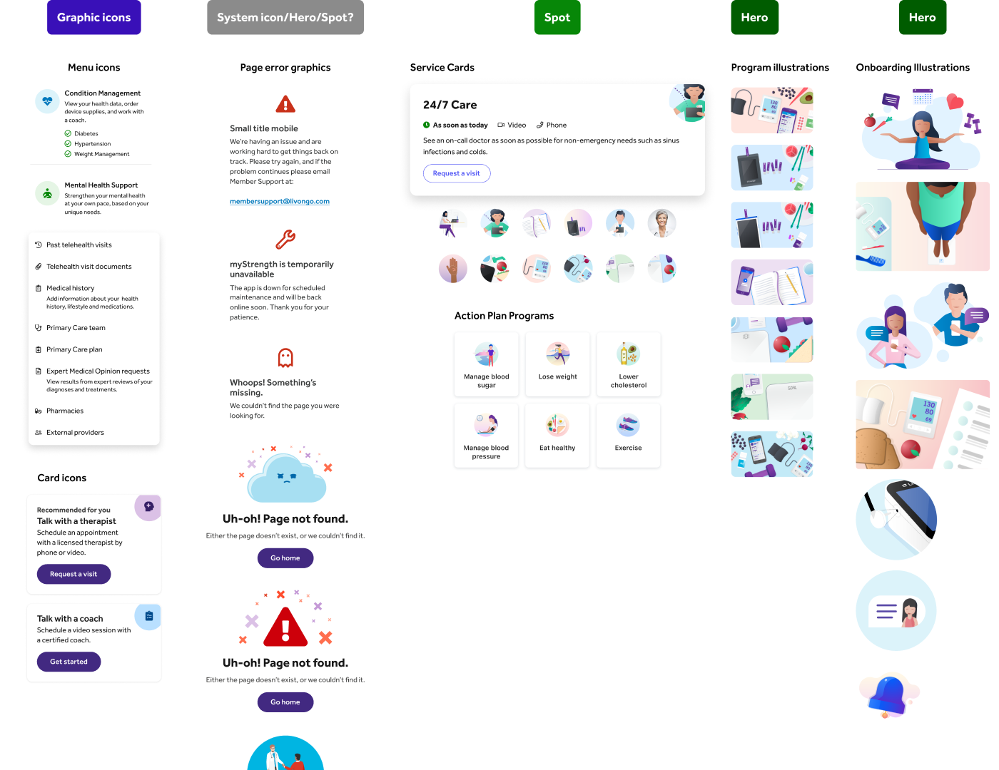
Engaging in discussions with the product and design teams, we evaluated successful elements and conducted an extensive audit of all illustrations used across various services. Utilizing tools like Airtable and Figma, we prioritized urgent needs and organized the overhaul into manageable phases. To create a unified visual language, we identified brand-aligned illustrations and tailored them to fit the desired color scheme and scenes for each user flow.

Key Insights
Through user research, internal discussions, and comprehensive testing of each flow for positive reactions, a standout illustration emerged. This particular illustration resonated the most with users, prompting the product team to integrate and adapt it into their existing design system. This iterative process ensured a more cohesive and brand-aligned visual experience for users.
Audit
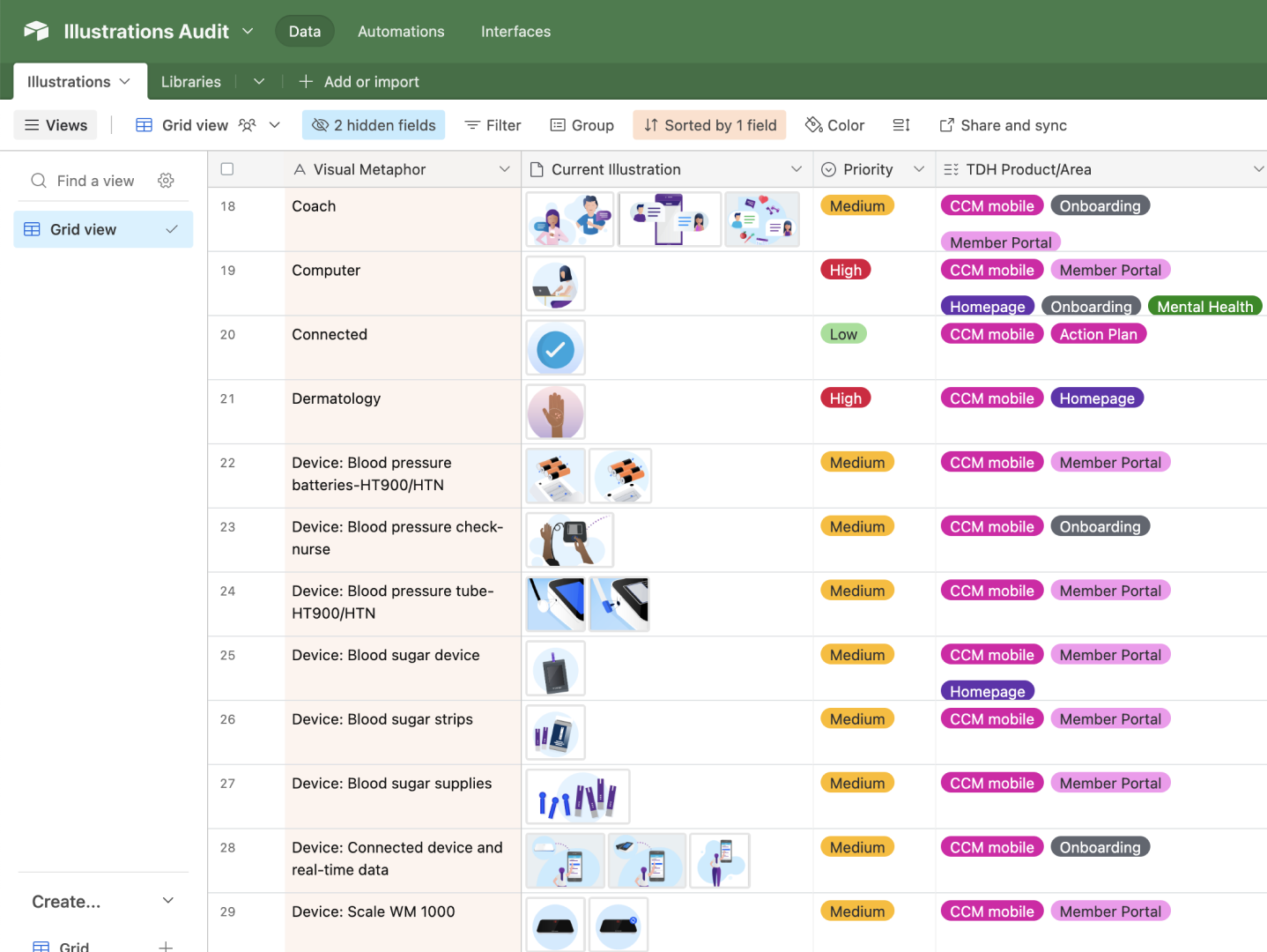
Previous Illustrations
Style A
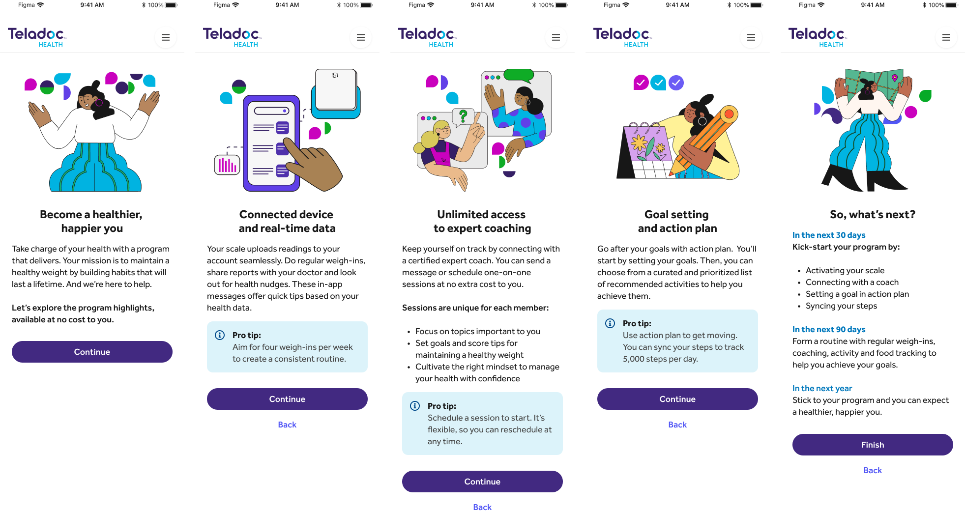


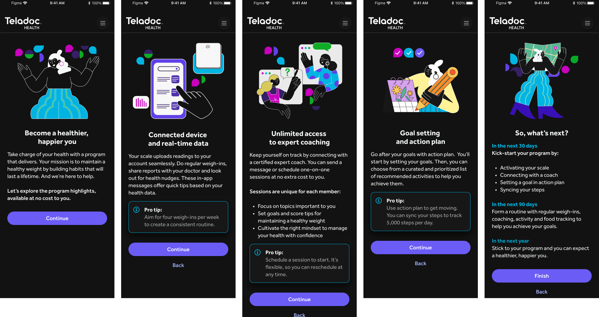
Style B
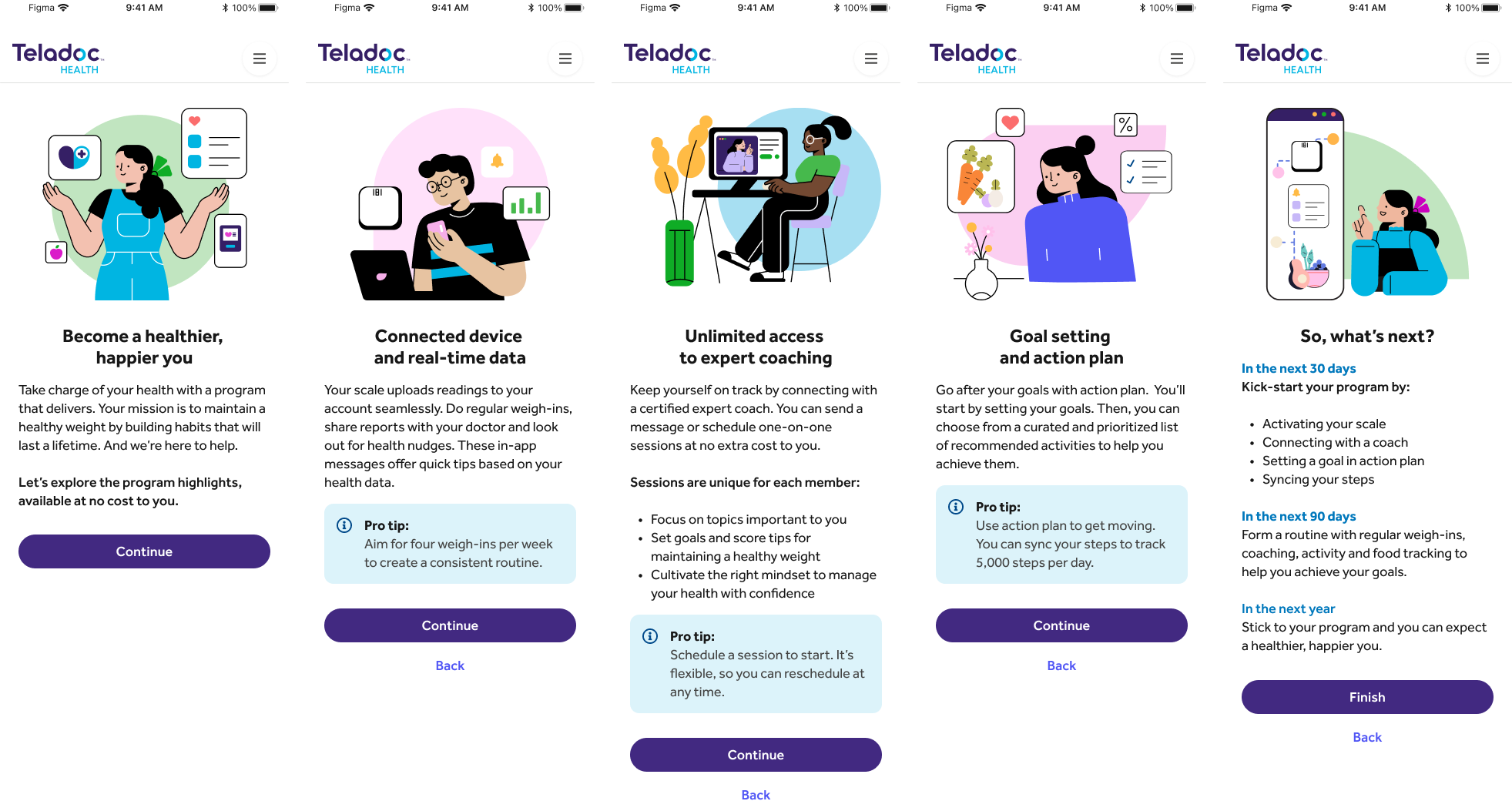
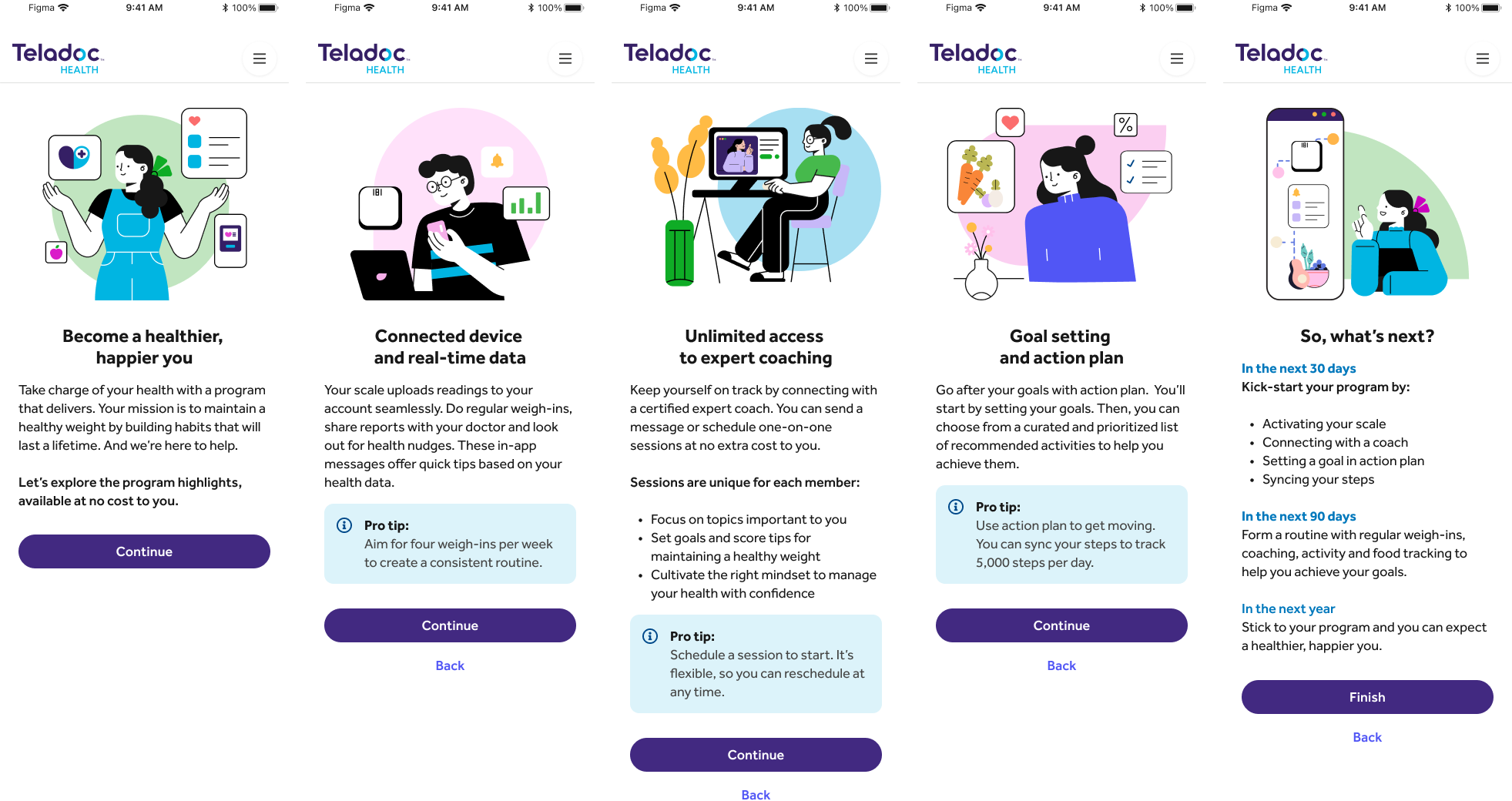
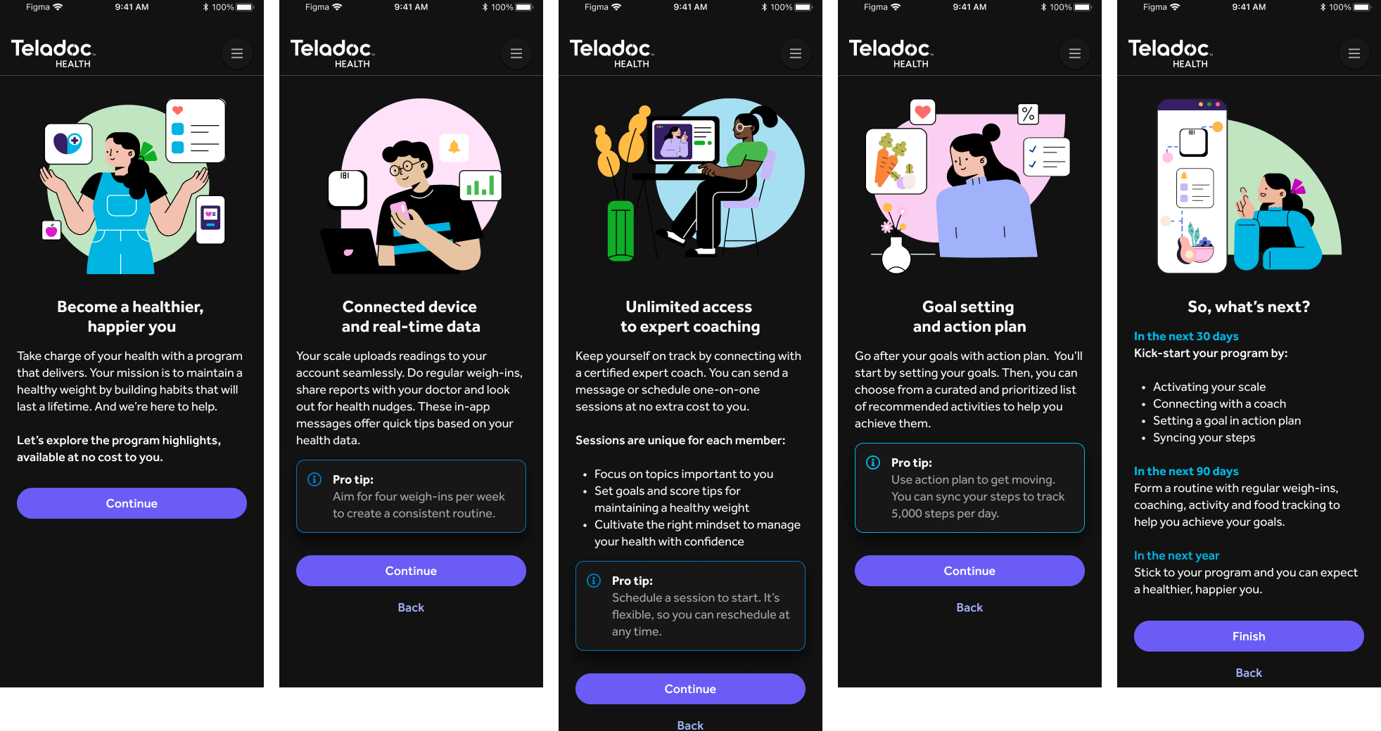

Style C
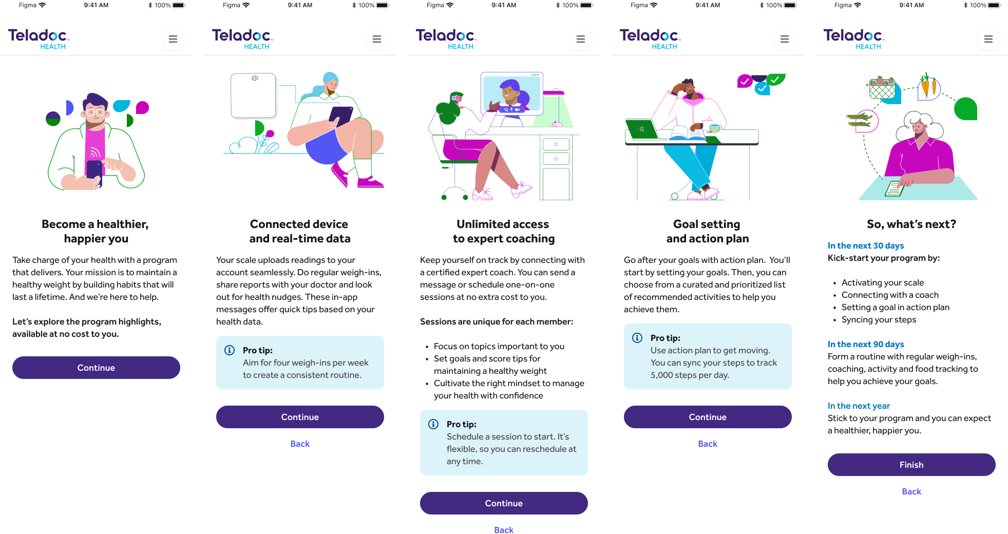

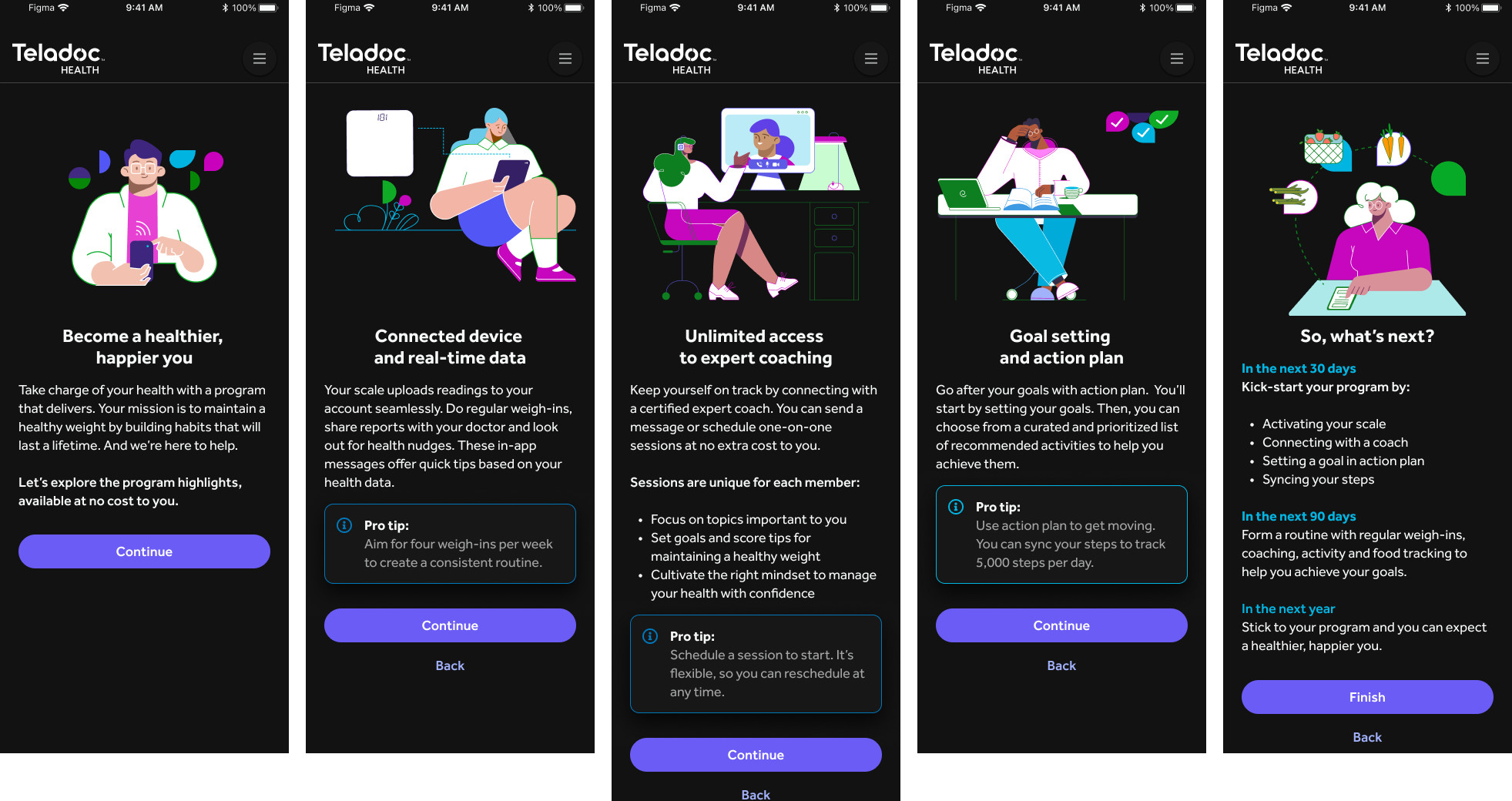
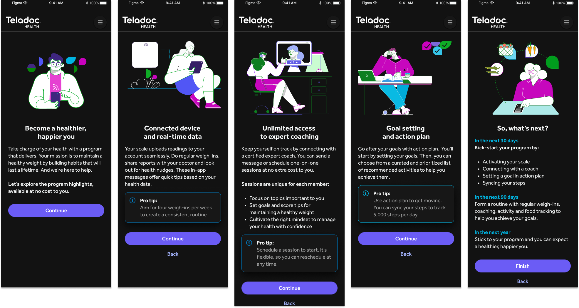
Research Summary
Here are some of the research answers the team got through user interviews and video responses:
A. Emphasize diversity in people depicted, including different genders, ethnicities, and body types. Prioritize positivity and inclusivity in representations, such as varying skin tones and body shapes. Ensure individuals feel heard and understood, incorporating gestures like hand-holding and putting an arm around. Choose images that are more inclusive and empowering, with an emphasis on diversity in skin color. Foster connections with others, particularly relevant for someone on a health journey, reflecting their values authentically.
B. Ensure images are descriptive and inclusive, representing a diverse range of people. Address the oversight where older or white individuals might not recognize the significance of depicting skin color. Prioritize representation that is proportional and realistic, with diverse skin tones that are achievable and light. Use informational icons to clearly indicate what users will experience. Promote empowerment, involvement, and positivity without body shaming, while featuring a multi-racial cast that appeals to a broader audience, including middle-aged individuals. Reflect the values without making suggestions or raising concerns.
C. Ensure alignment with mission statement values, emphasizing personability, making users feel heard, cared for, and valued, with sincerity. Prioritize simplicity and ease on the eyes, with fluid movements and concise messaging. Favor concepts that resonate emotionally, such as the image of a person engaging with a computer. Validate that the chosen concept embodies the mission statement values effectively, eliciting positive feedback and reinforcing user satisfaction.
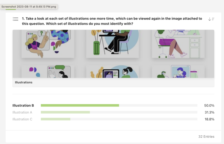

Conclusion
Based on user feedback, Illustration B emerged as the preferred choice, effectively encompassing the necessary aspects and aligning closely with the brand identity. These findings were leveraged to craft a comprehensive library for the app, ensuring flexibility and customization to suit various services and user interactions.


Thank you!
Special thanks to Aida Mendoza and Alison Horton for their initiative and collaboration with the creative and brand teams, making this project a reality.
